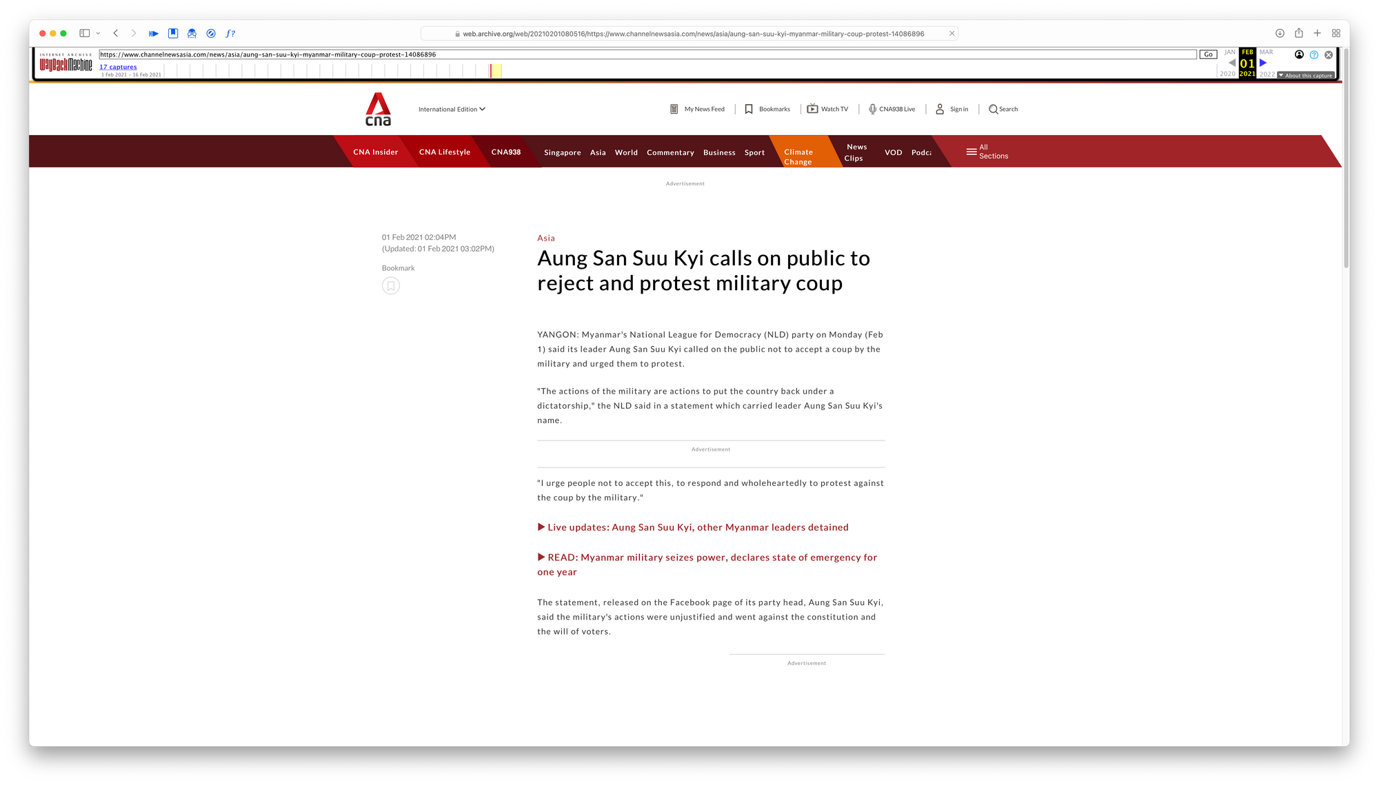
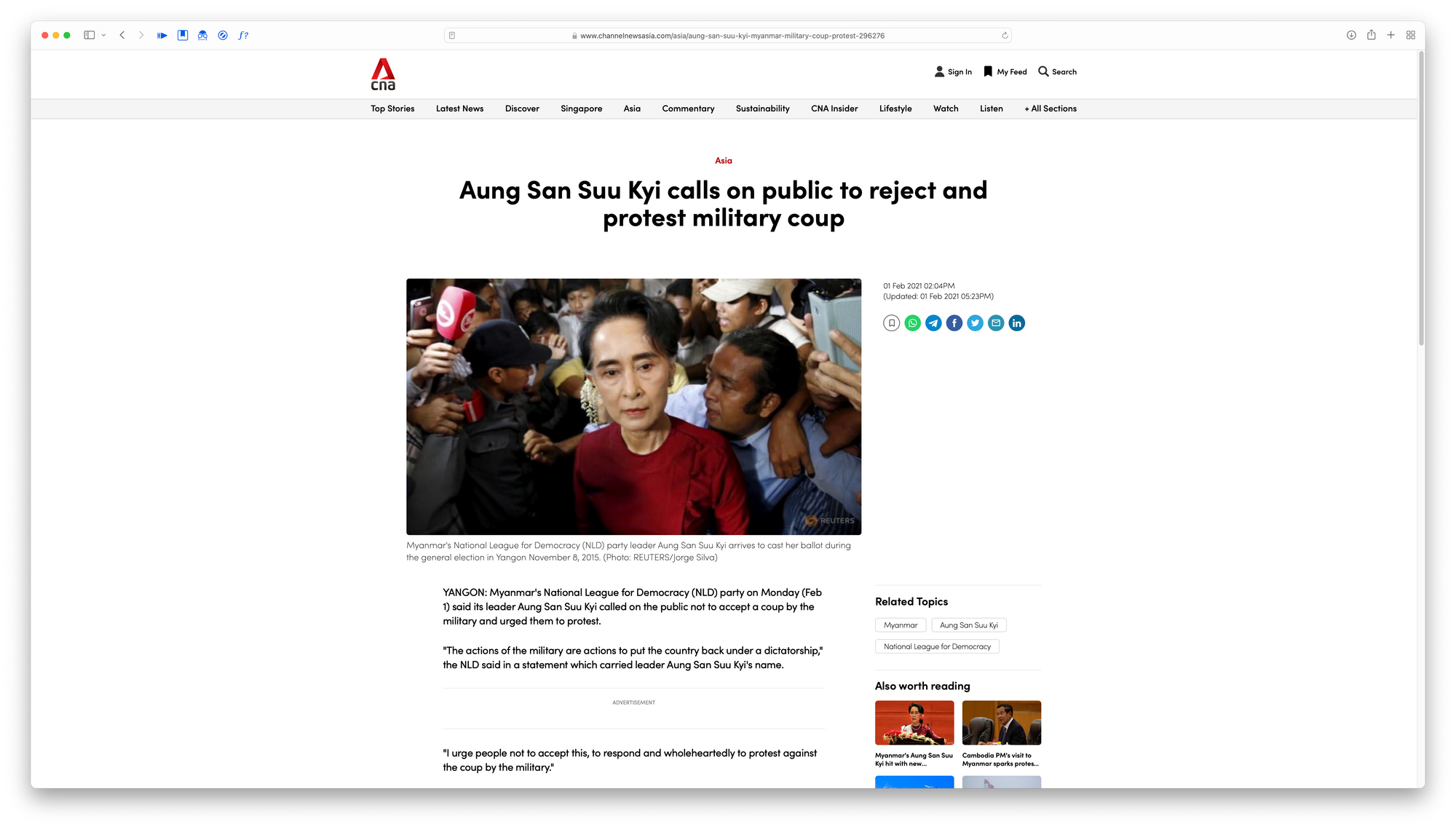
CNA changed its typeface to Sofia Pro. Here's why it's harder to read now.
As a disclaimer, I am not an expert in the field of design or typography. I am here just to state my opinion and to hopefully learn more.
To start off, if you are not from Singapore, chances are you might not have heard of this particular company. CNA (short for Channel NewsAsia) is a news and television channel based in Singapore. It is definitely one of the news channels that everyone in Singapore will know, even if they do not read or watch or listen to it everyday.
In August 2021, they did an application and website redesign. So far so good, right? The design is now more in line with the more modern web by cleaning up the top bar and to seemingly have a layout reminiscent of recent blogging sites. All I can say is that it is quite clean.
With a lot of design decisions, the choice of typeface matters a lot. The wrong choice can severely impact the credibility of the whole design. I had an academic award given to me in secondary school that used Comic Sans as its typeface. It cheapens the whole award, and it lies in some dusty corner of a storage bin in my house due to my disdain for it.
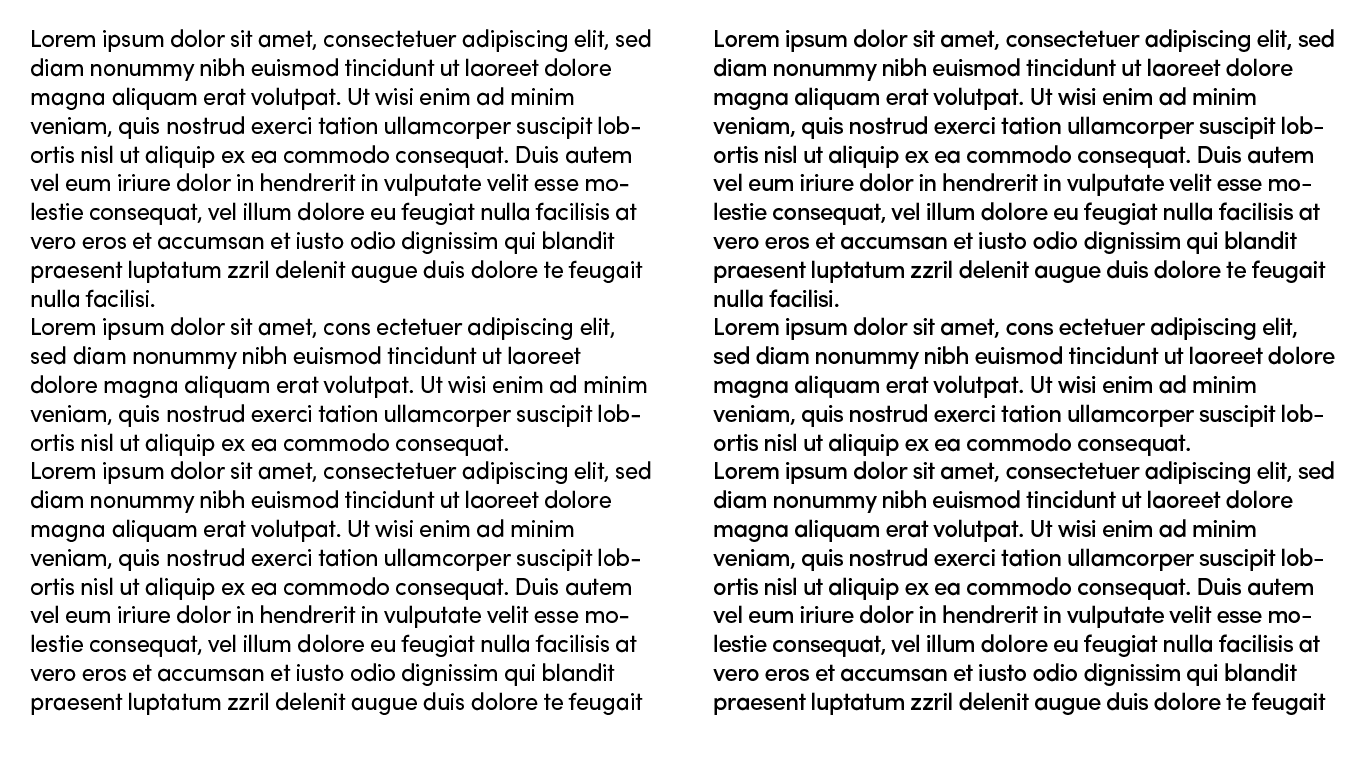
CNA did not do such a mistake like that, but it did do something subtle. It felt less readable. Legible, but it got a bit harder to understand what is being written, somehow. I do not know if it is just me, and if you think that it is very readable, do comment down below on your thoughts.
It is not that easy to distinguish between the letters when trying to read at a reasonable pace.
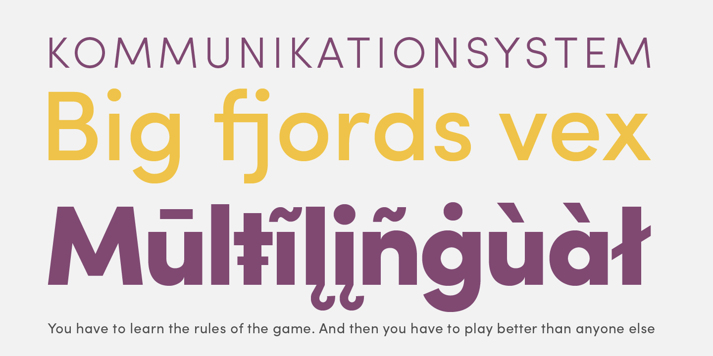
One notable comparison to be made is in terms of the typeface characteristics. Sofia Pro is a geometric sans serif font. This means that the font is formed mainly out of very clean geometric shapes like almost-perfect circles and straight lines. It is sans serif, meaning that it lacks those small bends that occur near the ends of letters. Some notable examples include Futura, Gotham, and even the now commonly used League Spartan.


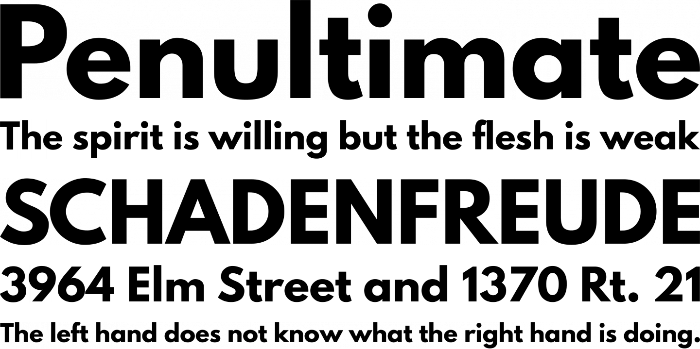
Sofia Pro is purported to have a larger x-height (this refers to the height ratio between the normal letters and the cap height) than a lot of other geometric sans serifs, but it is still considered to be short in comparison to many other fonts that are used in long-form text in our daily technological lives like San Francisco (Apple devices), Roboto (Android devices), and Segoe UI (Windows devices). Interestingly, these devices do not use geometric fonts at all, but instead relying on neo-grotesque and humanist sans serifs instead.

A low x-height is generally associated with lower legibility, especially when used in smaller fonts. Logically, it means that it will be a bit harder to distinguish between letters if the lowercase letter is comparatively small compared to the cap height.
Another issue with the font is its geometric nature. If you take a look at letters like a and o, you will realise that there is not that much to distinguish between them. Likewise for other word pairs. It is not that easy to distinguish between the letters when trying to read at a reasonable pace. There is an alternate version with a double-storey a, but this is not used in CNA's website.
Perhaps the easiest thing to change about the font is its weight. The CNA body font seems to be too bold. I am not sure if this is an overreaction to the even less contrasty and lighter font from before the redesign, or even just a problem with Apple devices in general, but something feels wrong about this.
I think something is obvious. People do not tend to use geometric sans serif fonts for their long-form content. Maybe except some of the less classical fonts like Montserrat and Gotham, both of which were designed with legibility in mind.
I do not have any problems with its use as a display font for titles or menu bars, and it does have its charms—feeling both modern and nostalgic at the same time—even though its usage in normal text bugs me. I have been using Reader Mode or its equivalents nowadays.
What do you think? Do you feel that this does not matter? Or do you feel that this also annoys you in some way? Feel free to leave your thoughts on the comments section below.